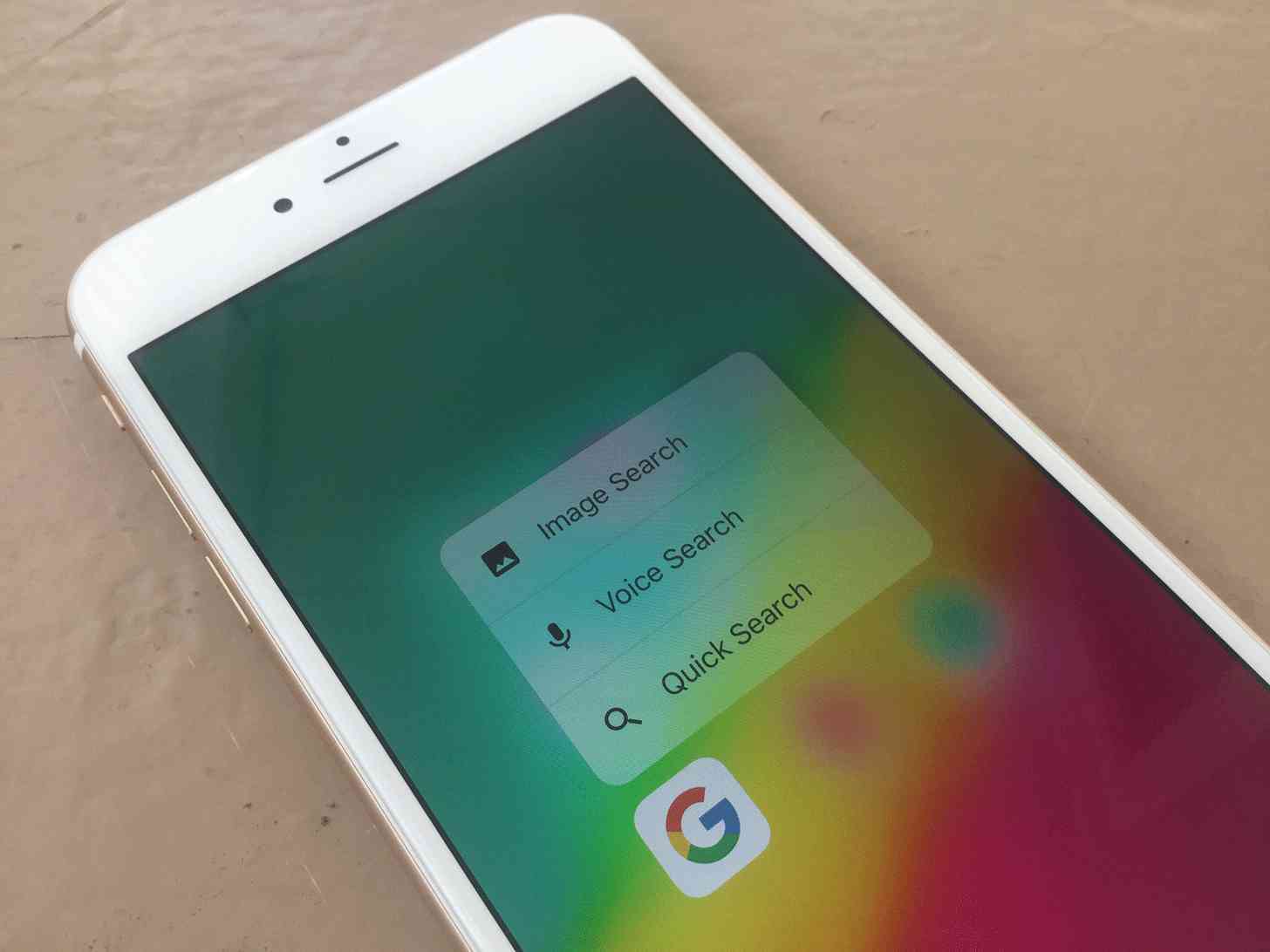
Apple has made quite the impact when it comes to input on our computing devices over the years, and the same goes for our smartphones. Multitouch features like pinch-to-zoom and others are all pretty standard --and intuitive-- control methods, and one of those things that has become the default across platforms and devices. When the company announced 3D Touch, it had the same kind of excitement for the feature, saying it was going to be the next important step for input on our touchscreens.
Here we are a few years later and the iPad lineup still doesn't have 3D Touch, and rumor has it that Apple is actually going to withhold the feature altogether in the upcoming 6.1-inch iPhone with an LCD screen. The two other iPhones, the iPhone X successor and oft-rumored iPhone X Plus, will reportedly still have it on board.
More than anything else, it just feels like an easily forgettable feature.
That isn't to say that 3D Touch isn't intuitive. Hard pressing on the display to get more information about something, or quick sharing options, or whatever else might be included is pretty cool. I think it comes down to the fact that there are wildly different outcomes from app to app when you hard press on an icon, with some apps simply not supporting anything at all other than to share the app itself.
Some app icons will show you a widget, which is typically pretty helpful. The majority of the apps that I use, though, offer a quick jump into a specific feature. Alto's Odyssey, one of the few games on my phone that actually supports 3D Touch at all, has three options: Share the game, jump right into Zen Mode, or jump right into the standard mode. The idea of 3D Touch is to make things faster, which, technically speaking, it does reduce the number of steps to get into Zen Mode, at least. But it's not any faster to start racing down the mountain in standard mode, because that's the game's default once you open it.
The real strength of 3D Touch might be when you're in an app. Hard pressing on an image will give you sharing options, or the ability to save it. Depending on the Twitter app you use, there might be a variety of different helpful options there. The same goes for the other social networking apps out there. But, in some cases, like when you want to save an image or share it, hard pressing isn't much different than just long pressing. Like you still have to do on the iPad lineup.
I use 3D Touch when I have to, like saving an image or sharing a link, but I can go long stretches of time forgetting the feature exists at all. I don't think it's as intuitive as pinch-to-zoom or other core input methods, but at least it works like it's supposed to. And it must be a noteworthy feature, because Google introduced a similar function --even though you only have to long press on an app icon to get context-based options-- with its Android platform.
It might also just come down to muscle memory, too. 3D Touch hasn't really latched on, so I'm still accustomed to simply tapping on an app icon to jump in. Hard pressing (or long pressing, if you're on Android) to select a specific function, even if that's my intended goal with opening the app in the first place, hasn't really caught on just yet. Maybe it has for you.
So while I use 3D Touch from time-to-time, I don't necessarily think I'd miss it all that much if Apple one day decided that it wasn't something it wanted to continue to work with. Or, if I can put in a request, make the widgets on apps more worthwhile, more functional. If I 3D Touch the Apple Music app icon, give me music playback controls. That would be super helpful.
Where do you stand with 3D Touch, or even the similar feature on Android? Is this something you use quite a bit, and have become a fan of? Or is this one feature that you could live without? Let me know!
Are you a fan of the 3D Touch feature? originally posted at http://phonedog.com
No comments:
Post a Comment